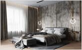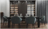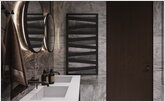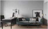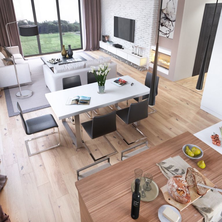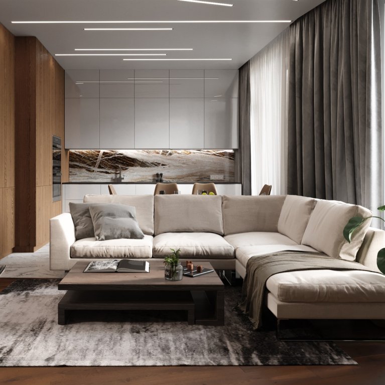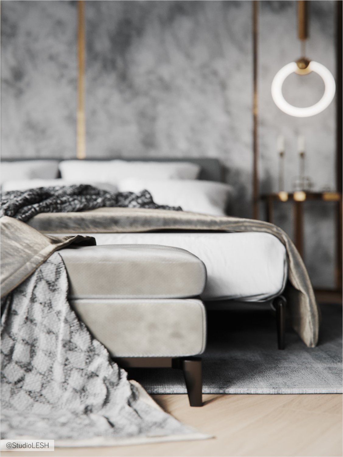
A family of four people turned to our studio because they wanted to combine two apartments for their large family. The task about the structure of the new layout was not only to unite the apartments, but also to create a space that will be safe for amusing children and comfortable for the whole family.
First layout:
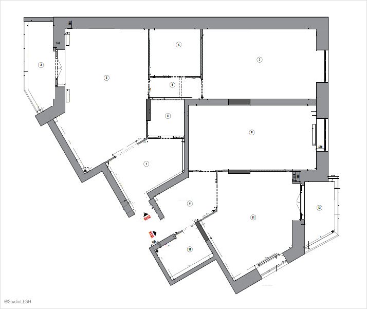
Final layout:
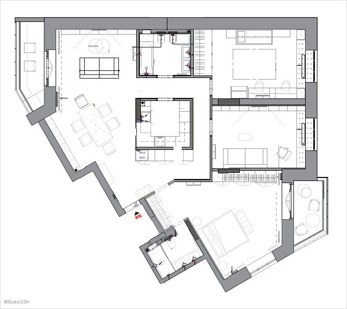
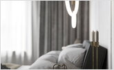
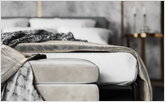
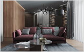
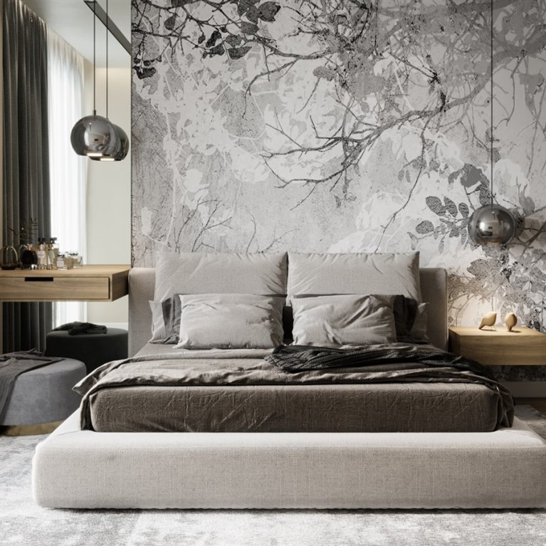
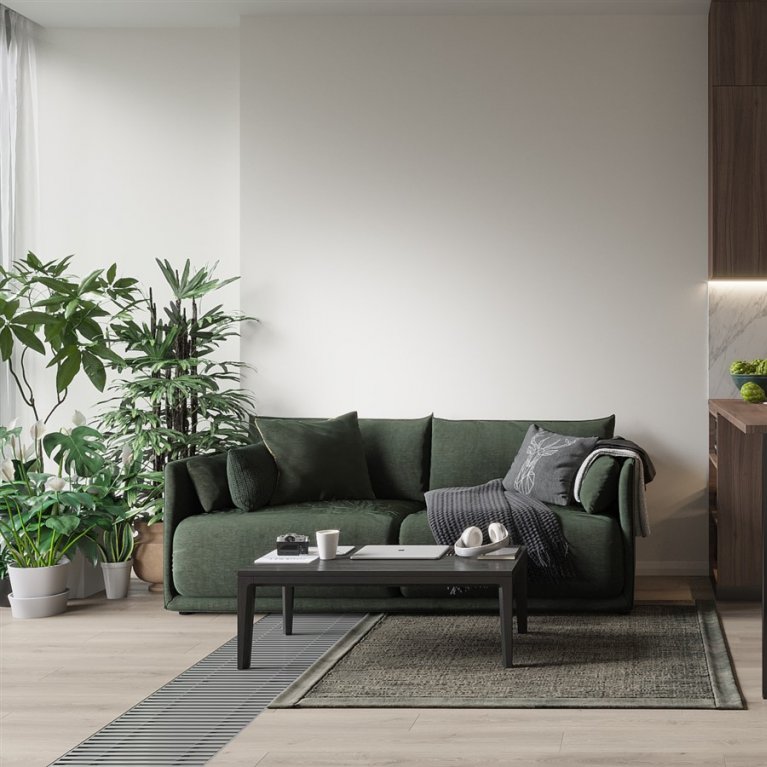
The project is made in modern minimalist style and combines the functionalism, a lot of light, light wood, saturated colors and a minimum of designer accessories.
- Multifunctional cube island with kitchen
- Linear track lighting along the contour of the living-dining room
- Non-standart windows and the opportunity of extra sitting
- Closed storage system behind sleek facades
Multifunctional cube island with kitchen
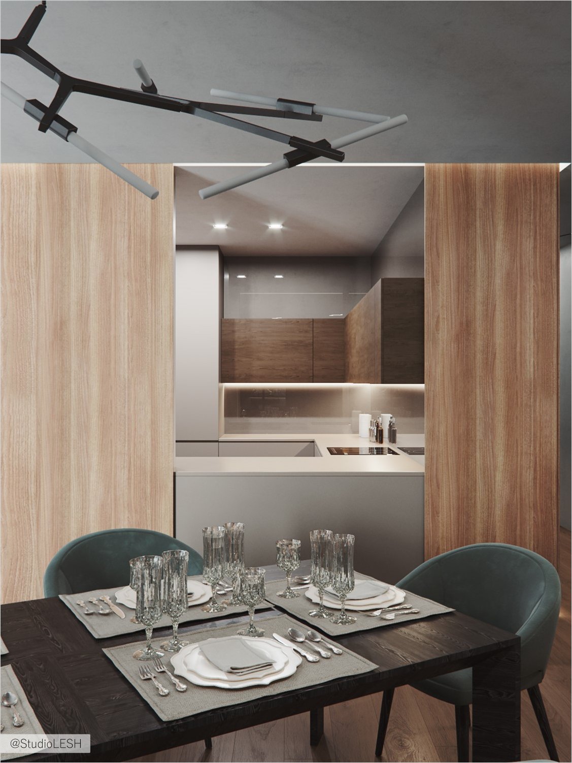
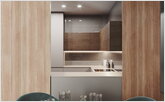
One of the wishes was to hide the kitchen in separate room. The room was made with the help of partition in the space of living room, dining room and the hall.
The kitchen is a cube finished under the light wood with many functions: on the outside of the cube there is a spacious storage area, inside - a full kitchen complect. On the dining area side there is a sliding partition, which, while opened, can be used as an additional place to house food, drinks and snacks.
Linear track lighting along the contour of the living-dining room
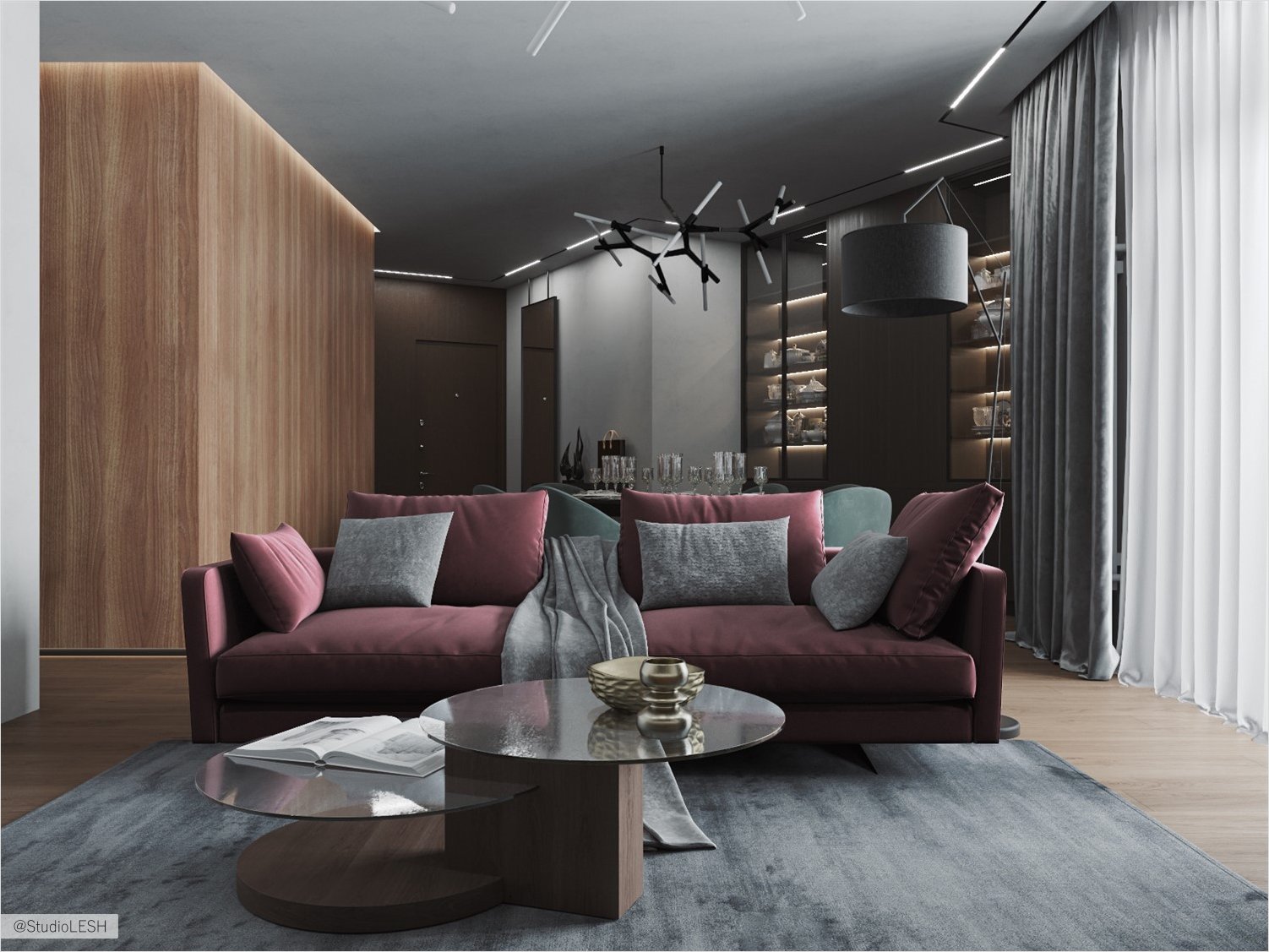
In order to create a bright apartment with only two windows in a huge room, it is best to design such lighting that will provide a comfortable atmosphere in the apartment. There were several variants of lightning organized in this project.
In addition to the main and local lighting was formed an illumination from the INF LINE BLACK track lights, which bend around the entire space of the living room, dining room and the hall. This solution is designed to combine space and achieve its maximum illumination.
Non-standart windows and the opportunity of extra sitting
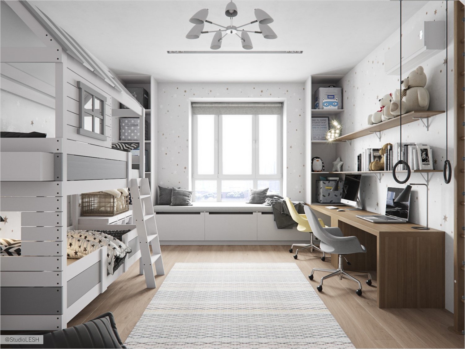
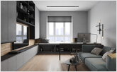
A characteristic feature of this apartment are the windows - they are bigger than standard one and that is why the window sills are located below normal. This feature has allowed to create additional rest areas in the children room and office, placing the pedestals with soft seats directly under the window.
The zone is thought out in advance, because there are the radiators under the windows. That is why there are ventilation holes for proper air circulation in the room as a whole.
Closed storage system behind sleek facades
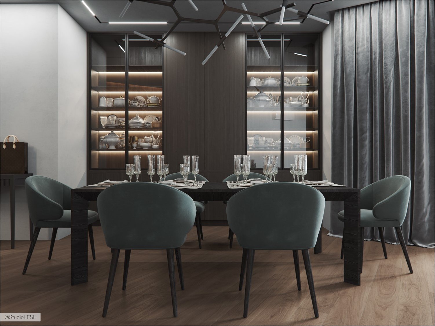
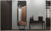
Storage areas in this project are located in wardrobes and are made from floor to ceiling. Modern minimalism means a minimum of additional accessories and smooth facades of storage areas, so it seems that all facades of wardrobes are a continuation of the walls.
Thus, there is a lot of storage space and a minimum of necessary things in plain sight in the interior. Due to the spaciousness of rooms and smooth facades, the storage area stay invisible.


