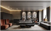
Today we are proud to present a new project commissioned by a client whose professional activity belongs to the field of business brokerage. Meet: luxury minimalism in the corporate style of LESH, embodied in the boundaries of the penthouse of the RED SIDE residential complex in the heart of the capital, on the street Krasnaya Presnya.
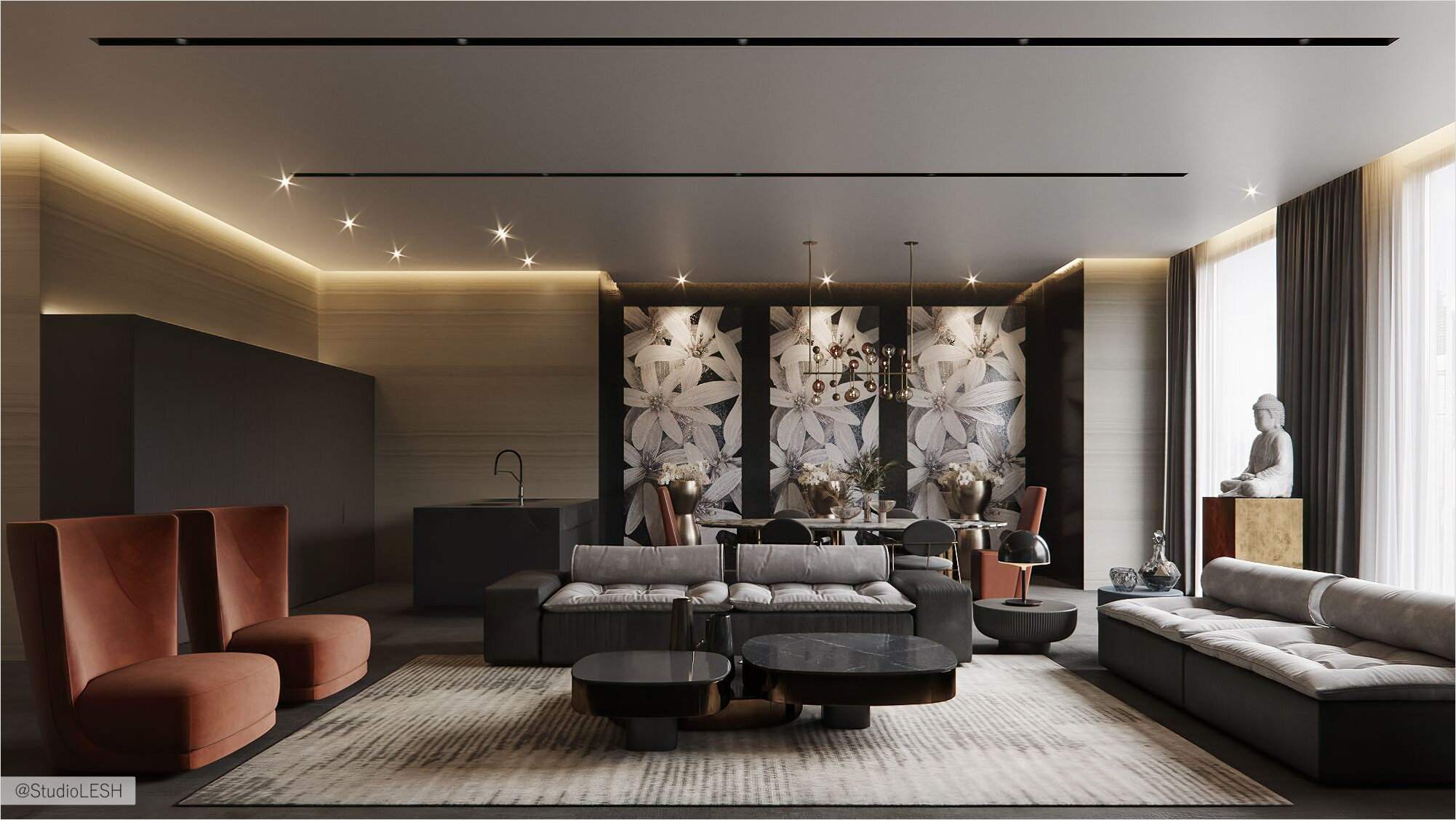
The main wish of the customer was to create an exclusive interior that will fit harmoniously into the overall concept of the premium RED SIDE complex, but at the same time will be an ideal place to fully relax from the frenzied pace of life in the metropolis. We can say that the idea was successful thanks to non-standard solutions and creative approach of the designer.
Hall: the magic of peace due to the light solution
The author of the project was very attentive to the design of the entrance area because it forms the mood in the interior of the entire apartment. Here, as soon as you step over the threshold, you are immersed in a magical atmosphere of peace and tranquility. The lobby is filled with soft, warm light. The effect is achieved by a stylish pair of Terra from Reflex (these sconces seem to be taken by the artist's hand from the night sky) and well-positioned spotlights.
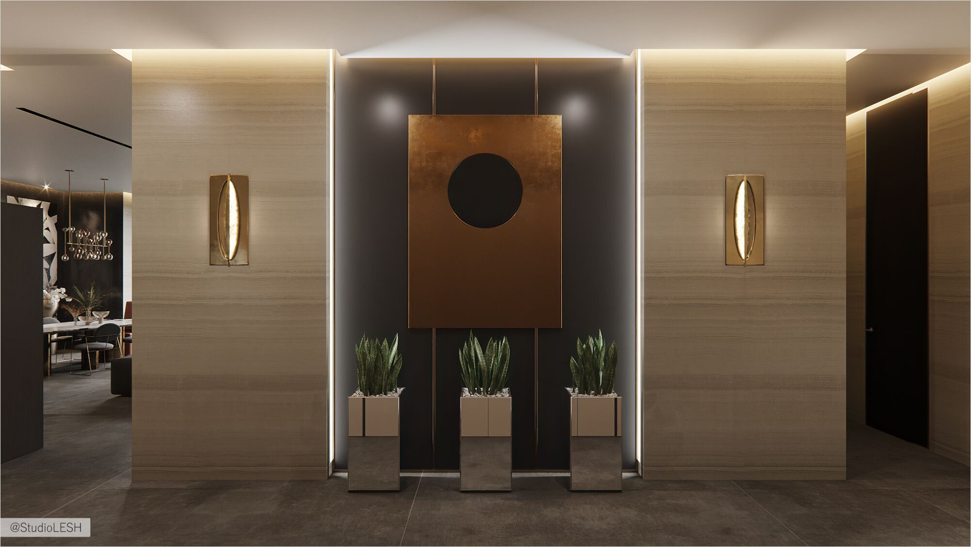
The corridor is partially separated from the living room by a wall with a rectangular niche, which is successfully decorated with Italian Frauflex and De Castelli panels. Three mirror vases Tonelli Design makes the composition complete. The mirror in a luxurious frame, stylized in aged bronze and decorated with Sicis mosaics, is also equipped with led lighting. By the way, mosaic tiles of this Italian brand were also used by the author in the design of the private area.
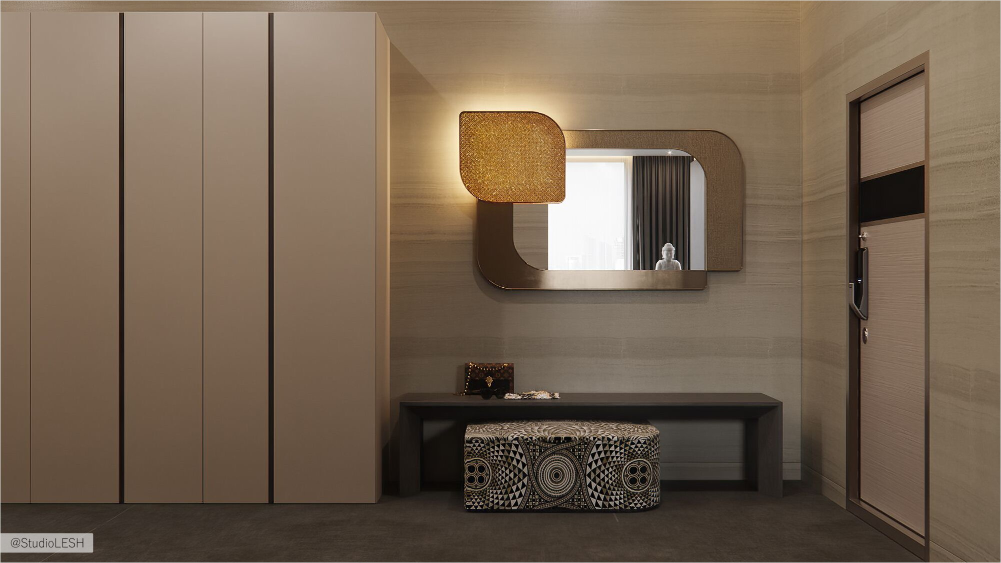
Another object in the lobby attracts the eye — a luxury glass console from Sicis, which is crowned by a unique bowl handmade by artist Regina Medeiros. A worthy background is the amazing beauty of the panel, made in the tradition of abstractionism.
Living room: comfort and functionality zone.
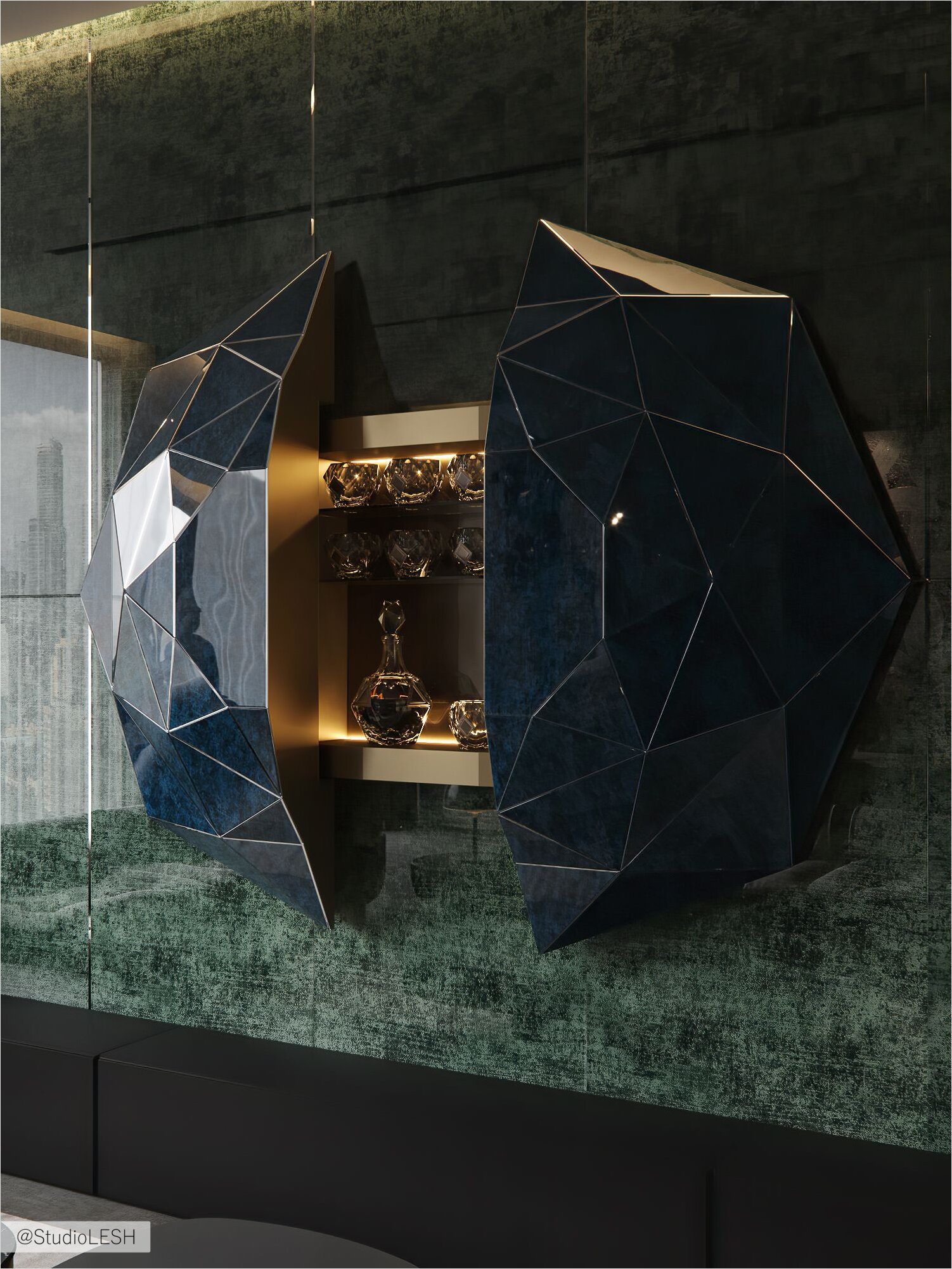
In this project, it was decided to move away from stamps and abandon TV. It is interesting that at first, it was not easy for the client to part with the idea that a “black square” should be located opposite the sofa. But the designer managed to convince him that it was time to get rid of stereotypes. As a result, the TV was replaced by a luxury bar from the luxury collection Diamante by Sicis, which beauty is highlighted by a magnificent background in the form of panels of an antique green hue.
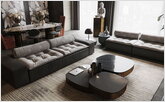
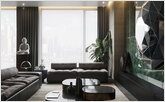
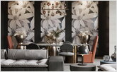
The successful filling of the living room with upholstered furniture from Baxter, refined coffee group Chrysler from JMM, as well as other stylish and functional items from European furniture brands allowed you to get a comfortable modern area for family holidays and pleasant parties with friends.
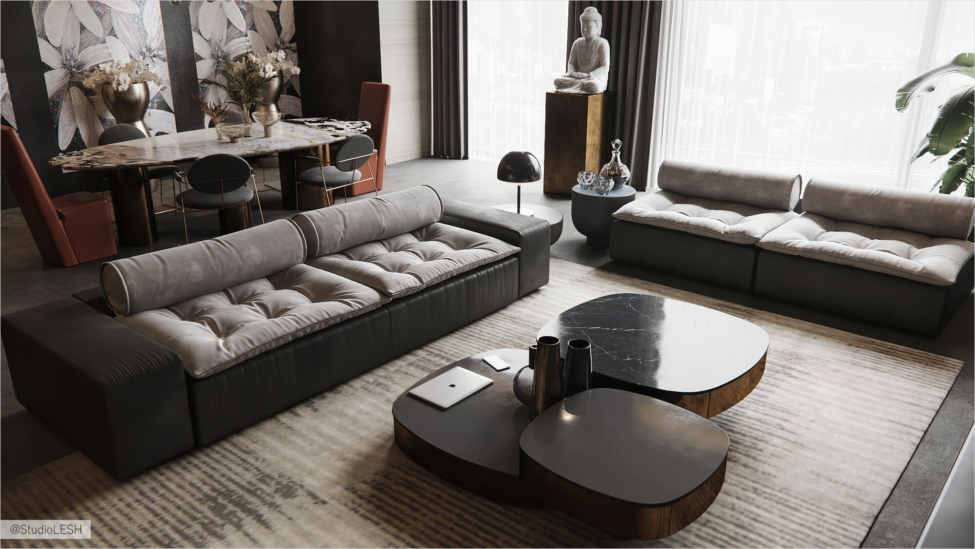
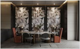
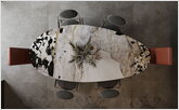
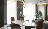
Special mention should be made of the dining table from the Lagos collection by Baxter on cylindrical legs of different sizes with a spectacular stone countertop. The composition is complemented by an elegant accent over the dining group-a Fluxus lamp in the form of a thin frame in matte bronze, decorated with decorative spheres of glass of different diameters.
Kitchen area: unconventional and stylish.
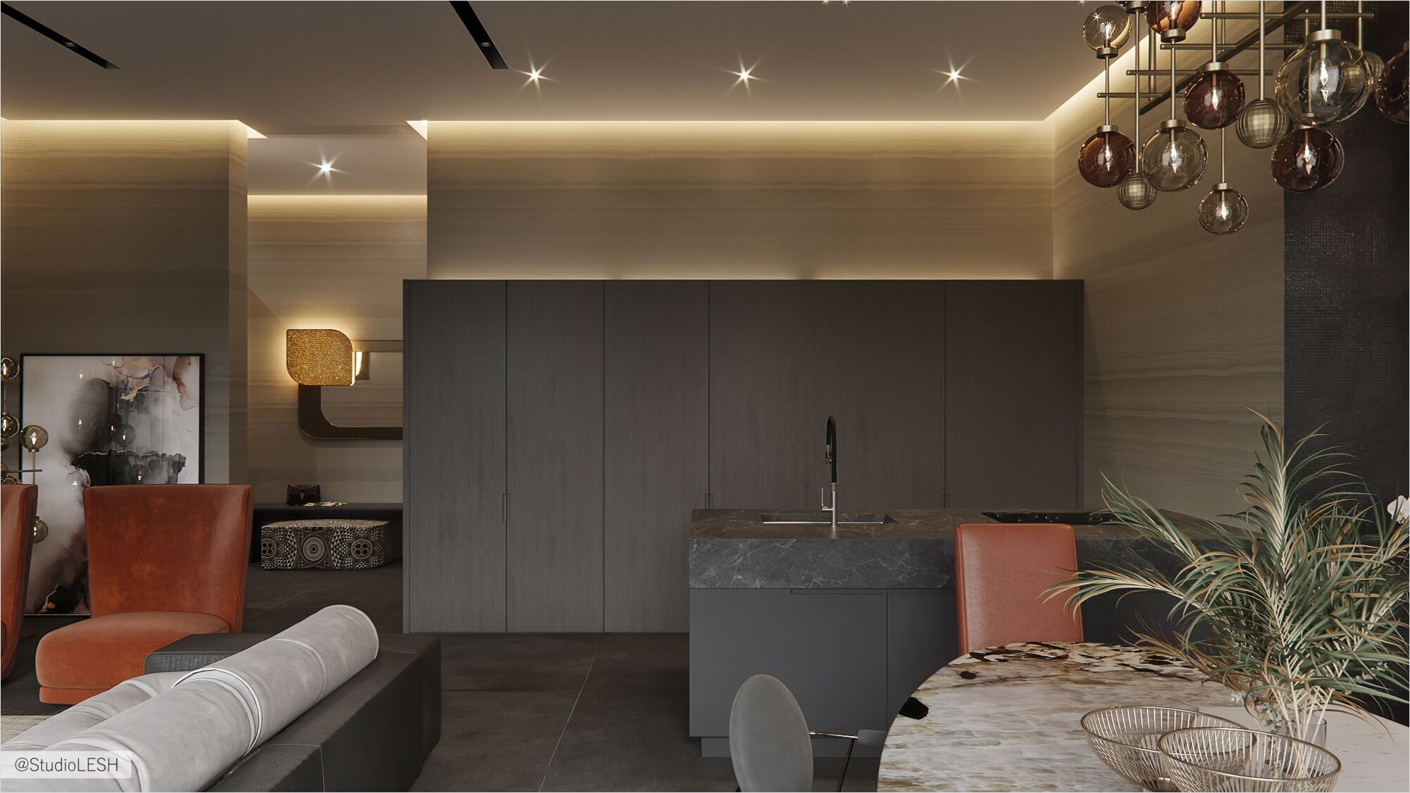
The complete absence of overhanging numerous cabinets and shelves in the cooking area is a design find aimed at creating a unified stylistic space with the rejection of annoying standards.
The kitchen Maxima from Cesare fits perfectly into this interior. Functional solutions of this manufacturer open wide horizons for design ideas, allowing you to go far beyond traditional kitchens.
Floors of granite tiles: an alternative to the tree
Another feature of the design is the rejection of classic wood flooring in favor of a modern floor from the collection of large-format porcelain tile Tesori from Florim. In combination with the warm background of wall coverings from the Armani Casa fashion collection, Italian stoneware slabs look solid and unusual.
Results
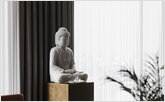
To sum up, we can say that the interior turned out to be quite consistent with the author's style, which combines the gift of creating luxury interiors with the client's life scenario, understanding of their comfort zones, and life habits. The signature style of Studio LESH founder Michael Mohr is luxurious minimalism with an optimal number of elements, but where each item is a real work of art. In all zones, there are details that have a special magnetism that attracts the admiring gaze and make you freeze in contemplation of the beautiful. However, despite the tendency to luxury elements against the background of restrained color and texture solutions, the author observed a key rule — all efforts should be aimed at harmonizing the client's desires and their future daily comfort.


