Interior is more than just a beautiful picture, it's the life of people, their feelings, their rhythm, and even their plans for the future.
The interior of the apartment reflects the customer's tastes or his dream, which inspires us for creating space because making someone's dream come true means a wizard's job.
So, here is the object: studio apartment 48 sq. m with standard ceilings of 2.8 m and two standard windows. As a result, after working through and rethinking all the desires and affords, we've managed to create a non-standard apartment with its individual, remarkable interior and features.
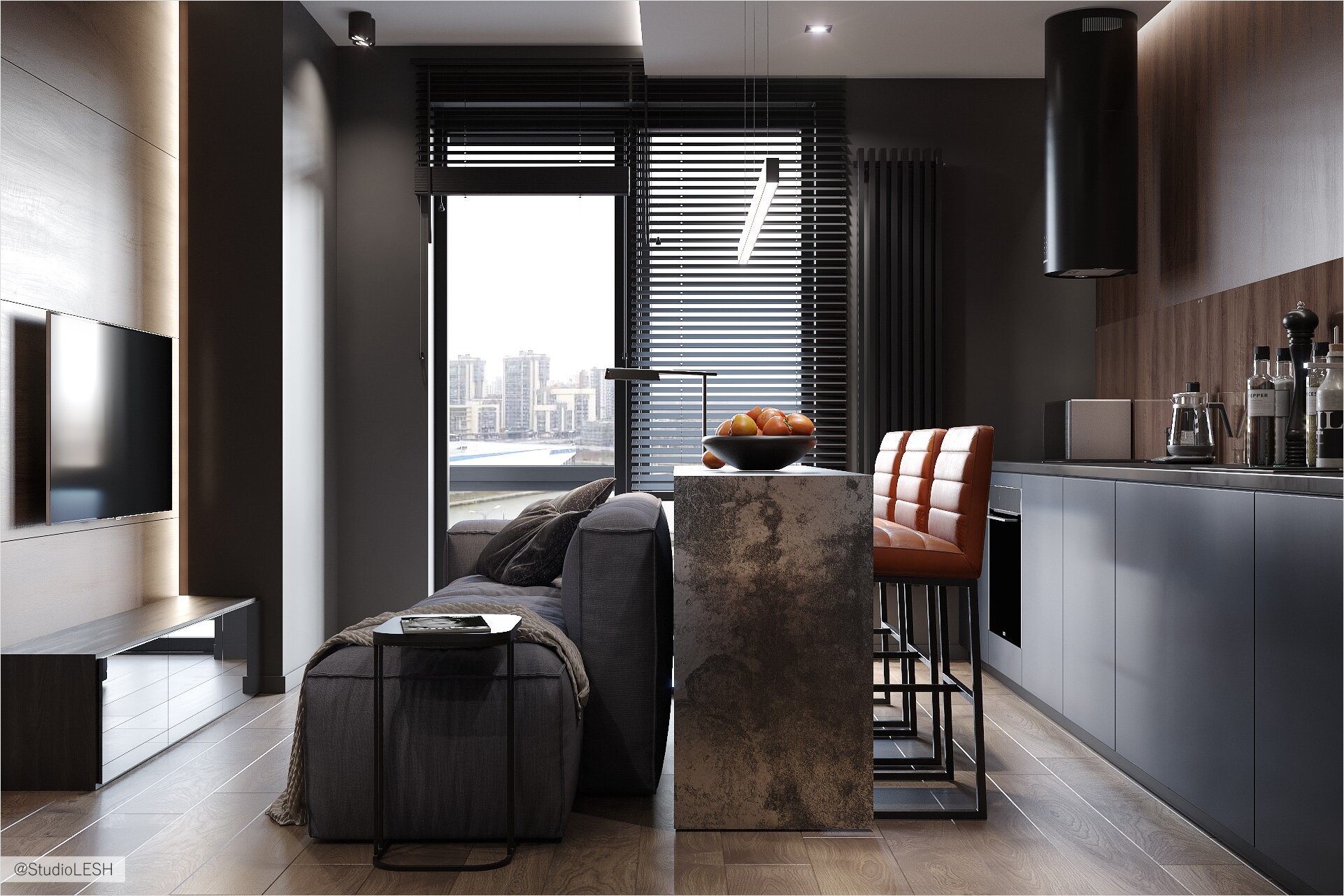
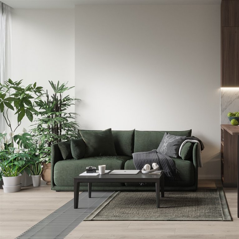
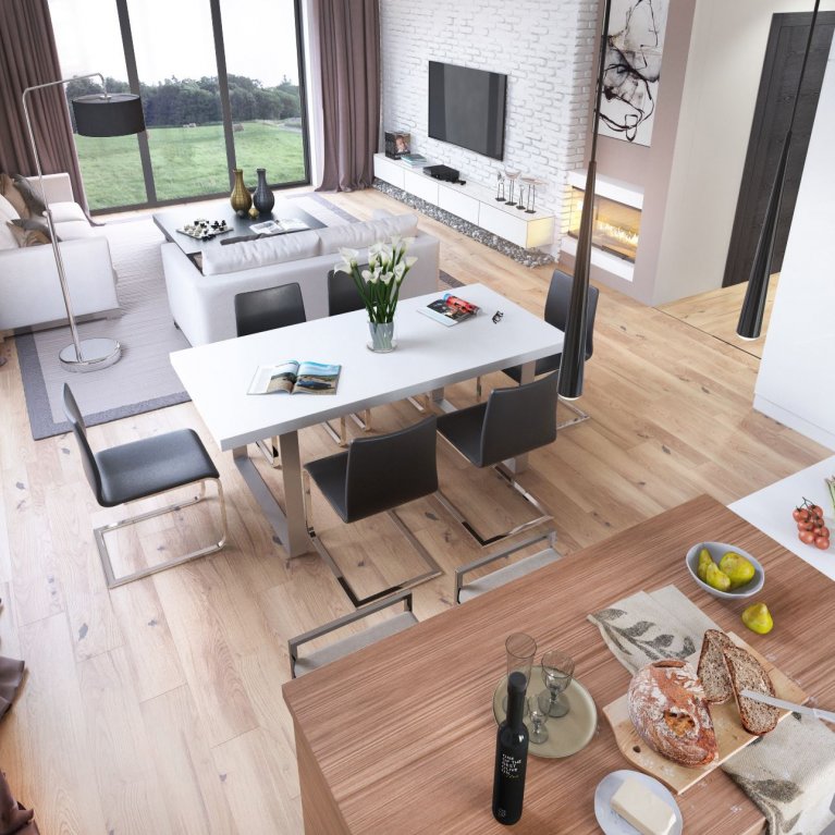
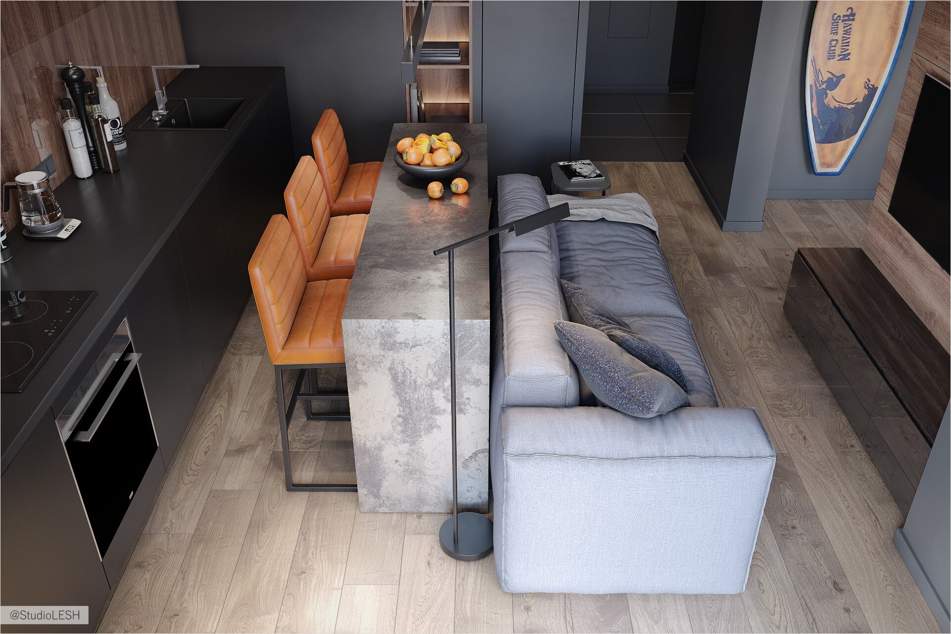
The area isn't as large, but in terms of functionality, it has got all possible filling. The kitchen is combined with the living room area with the sofa, and the TV area, the bedroom is combined with the study (working area).
Presence of two risers enabled to free the bathroom and the kitchen from the washing machine and move it to the wardrobe storage area, that was a huge advantage, because the space occupied by drying and washing equipment made it possible to create a more spacious bathroom, and equip it with a fairly comfortable 1.5 m shower.
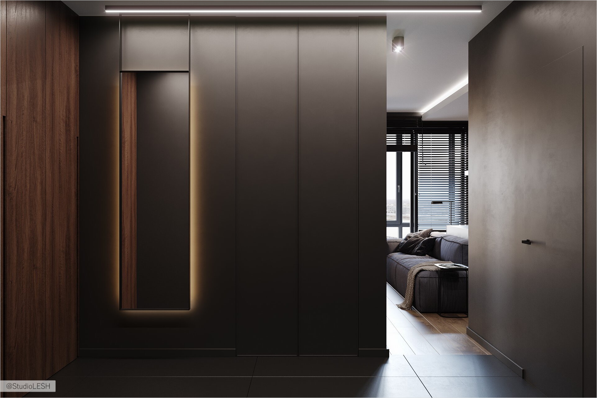
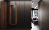
Besides, the interior has one extra solution which is the concealed door to the Perfetto Porte bathroom, which also makes it wider. Due to this, there appears a plain wall that isn't broken by doors and plant bands, and, as a result, the space becomes clear and extended. The hallway is becoming visually larger and it can be used as a full-fledged room, as the dirty area of the apartment is separated from the rest of the space, due to the integrated doors of the wardrobe system with the ceiling, that is creating the air in the space.
One more technique applied throughout the apartment — a plinth with a standard invoice painted in the main wall color, which is providing the height and integrity of the perception of the plane. The applying of such a solution, and, of course, the absence of any cornices and moldings, the room is becoming visually higher, and the standard ceiling level of 2.8 meters seems higher. Such solutions are essential for improving the quality of your house space.
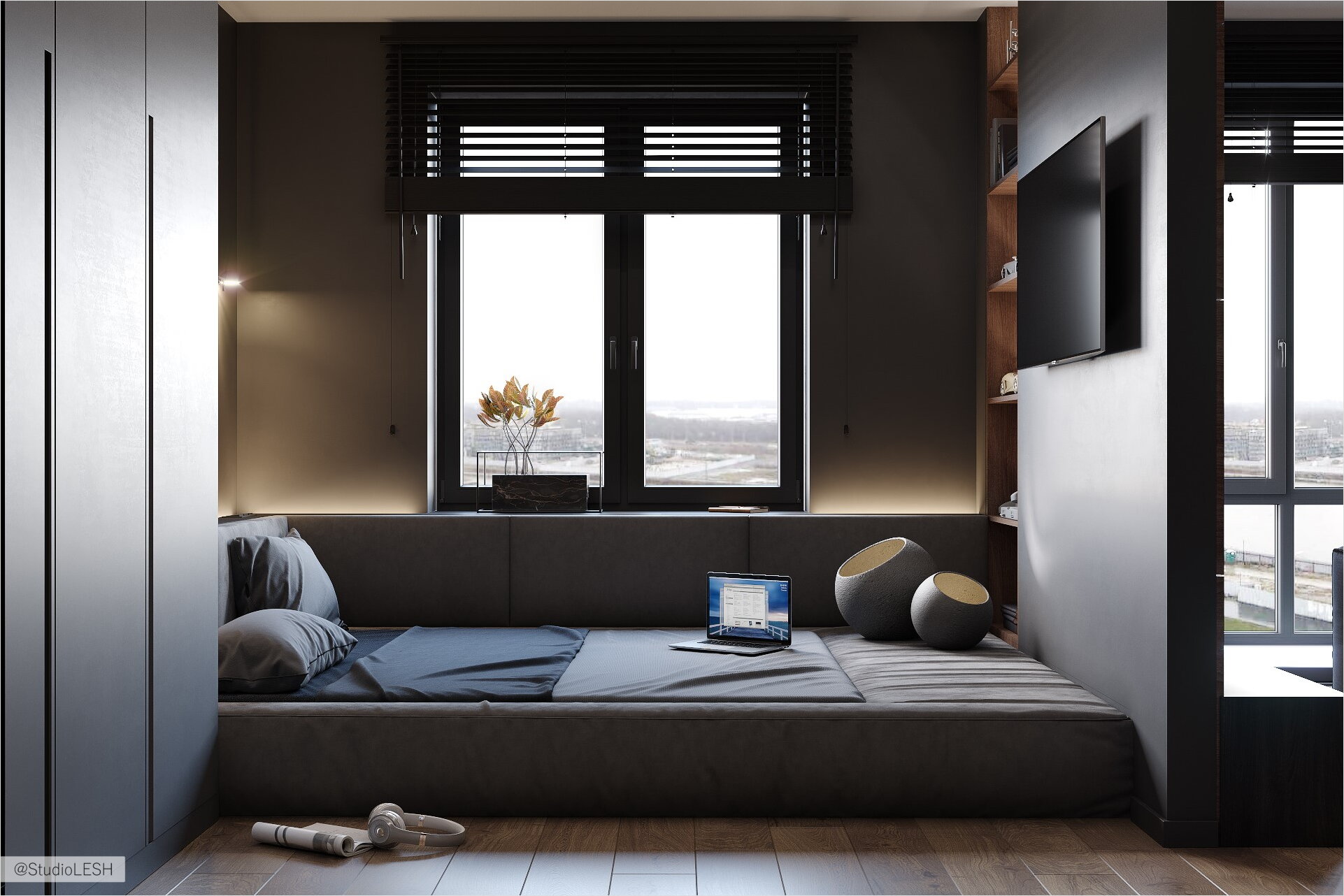
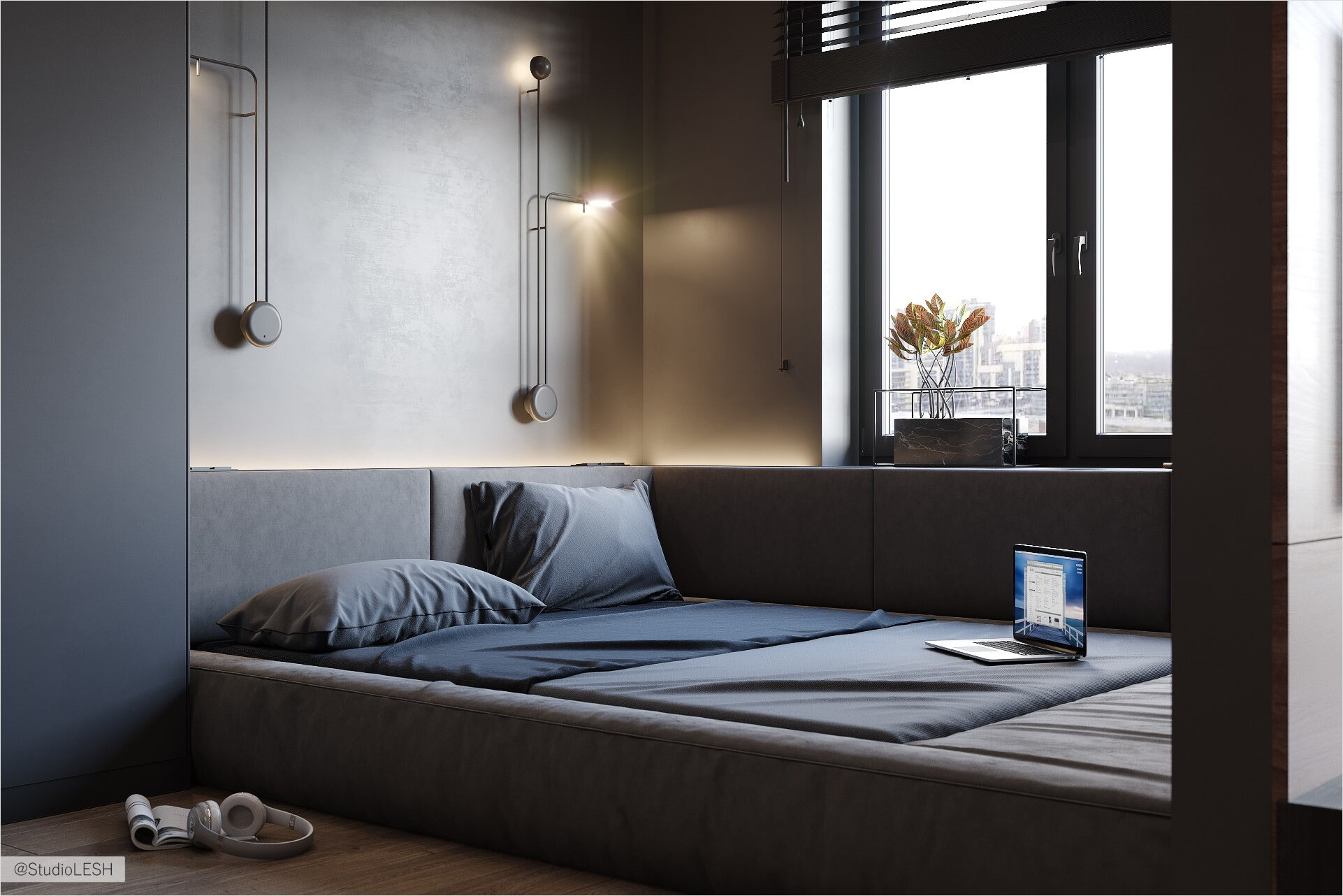
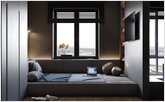
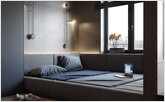
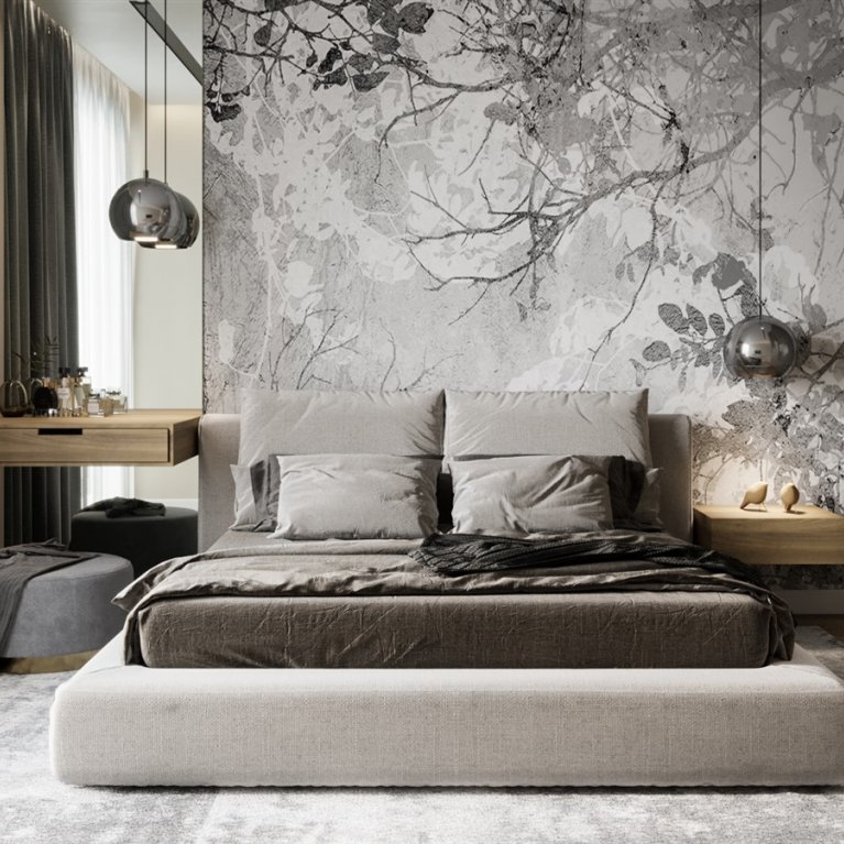
The bedroom deserves particular attention because of its unusual planning decision, even though it's rather simple and obvious. Two functions in this room are packed in one, but, what's important, none of them became dominant.
The sleeping place belongs to the window and, on the one side, it has a wide orthopedic mattress for healthy rest, and, on the other side — a lounge area with soft sides where one can hang out with friends.
The tabletop, which is designed as a continuation of the window sill, also enables one to put a book or a drink, that gives this area a multifunctional load. The workplace is laconically located opposite to the window, taking a convenient place in a niche next to the wardrobe, where the doors are made to the full height of the room.
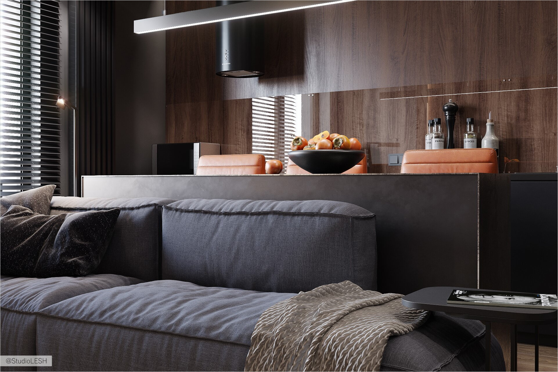
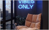
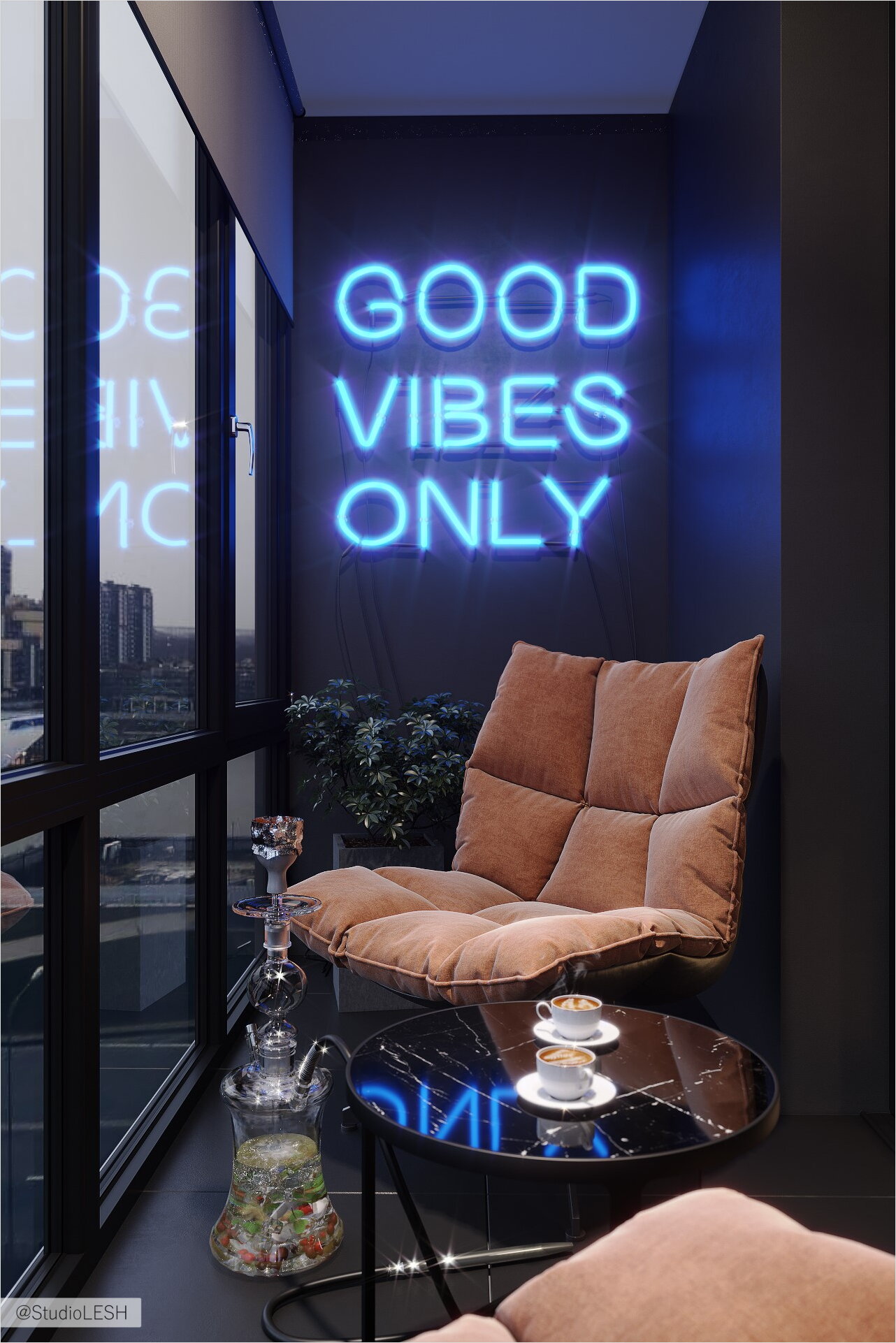
The kitchen living-room also deserves attention. It's necessary to note a few interesting and important points — first of all, the replacement of the glass unit separating the kitchen and the balcony with a sliding door of the slider type. Such a solution enables to easily legalize the redevelopment because the loggia doesn't merge with the room, but at the same time it's quite serious to expand and increase the functionality of the living-room kitchen, as well as enrich it through panoramic balcony windows, the double-glazed windows in which, are also replaces by two-chamber ones, so that the loggia won't be cold anymore.
The radiator, of course, remains within the kitchen dimensions, but it's being replaced by a designer, vertical layout. In this case, the model of a tubular 1.5 m high Loten gray radiator is suited very well. The built-in refrigerator is also worth noting as it's visually absent in the kitchen, and this is usually the bulkiest equipment. Due to the smart planning solution, and the same color of decorating the walls and the door, it magically disappeared.
ЗIt's also worth to pay attention to the kitchen without hanging cabinets and an apron made in the "wood" material which runs like a red line through the entire decoration of the apartment, the working apron height up to 1.4 m is finished with transparent tempered glass that is easy-to-wash and shows an interesting play of reflections.
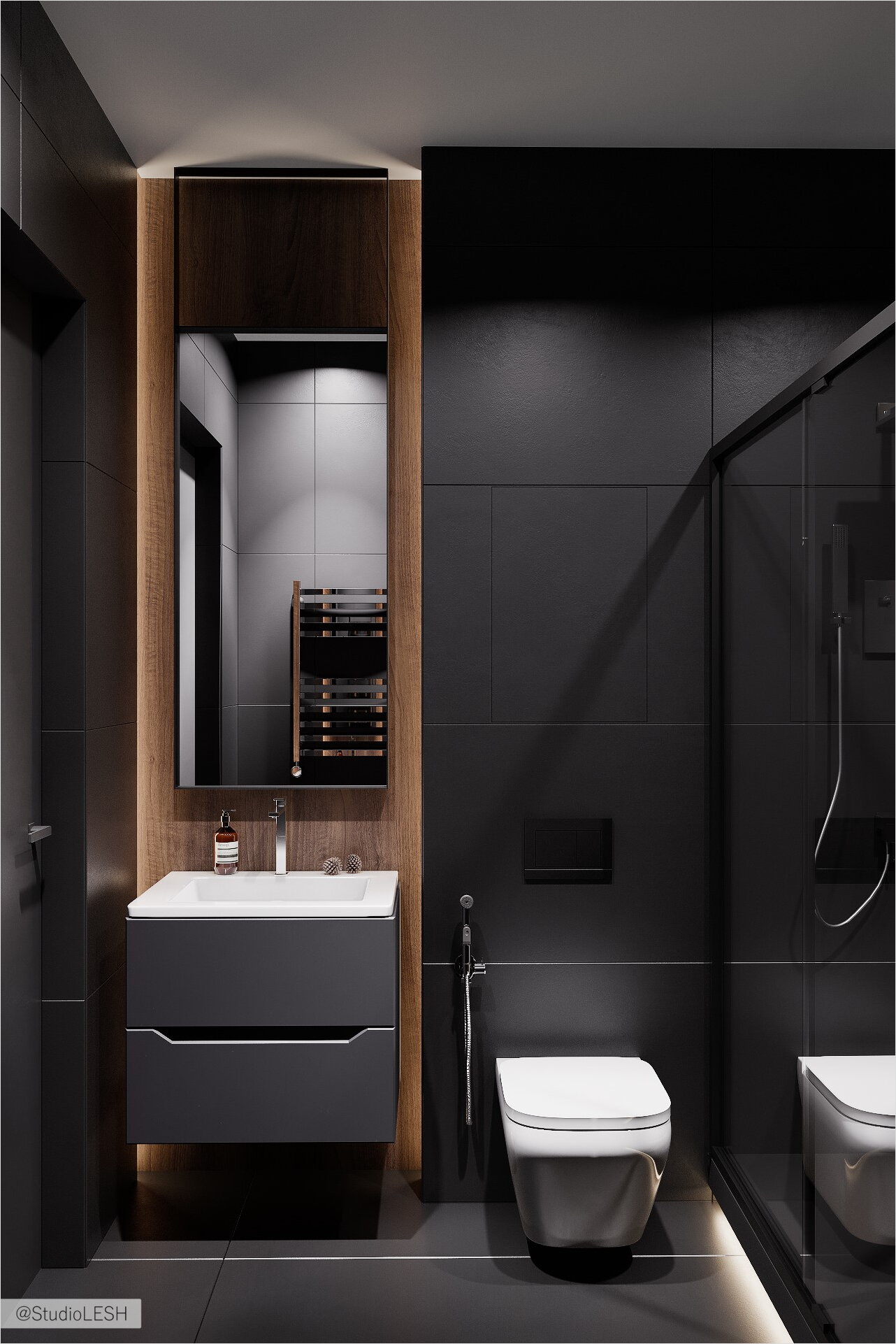
The entire decoration of the apartment is made in the dark gray tones, with black tiles in the bathroom, but the color of the natural wood with the texture of the American walnut provides a tactile and cozy perception of the whole interior. In this case, the dark interior is a technique that argues with the stereotype of space narrowing. Of course, it's not the point, the key thing is the designer's work with colors, functions, and textures.
A highly important place is given to the light in this project. Lighting scenarios within a dark interior are relevant as anywhere else, as they provide very interesting and extraordinary solutions. This apartment is excellent proof. Don't hesitate to choose dark interiors, because they look stylish and comfortable.


